

Jackie Chan in the new Karate Kid movie.
Had a small blurry ref pic. But I think it turned out alright. I need to find a better way to take a picture of it.
Which image do you think is best?
 The Bowler from the movie "Mystery Men"
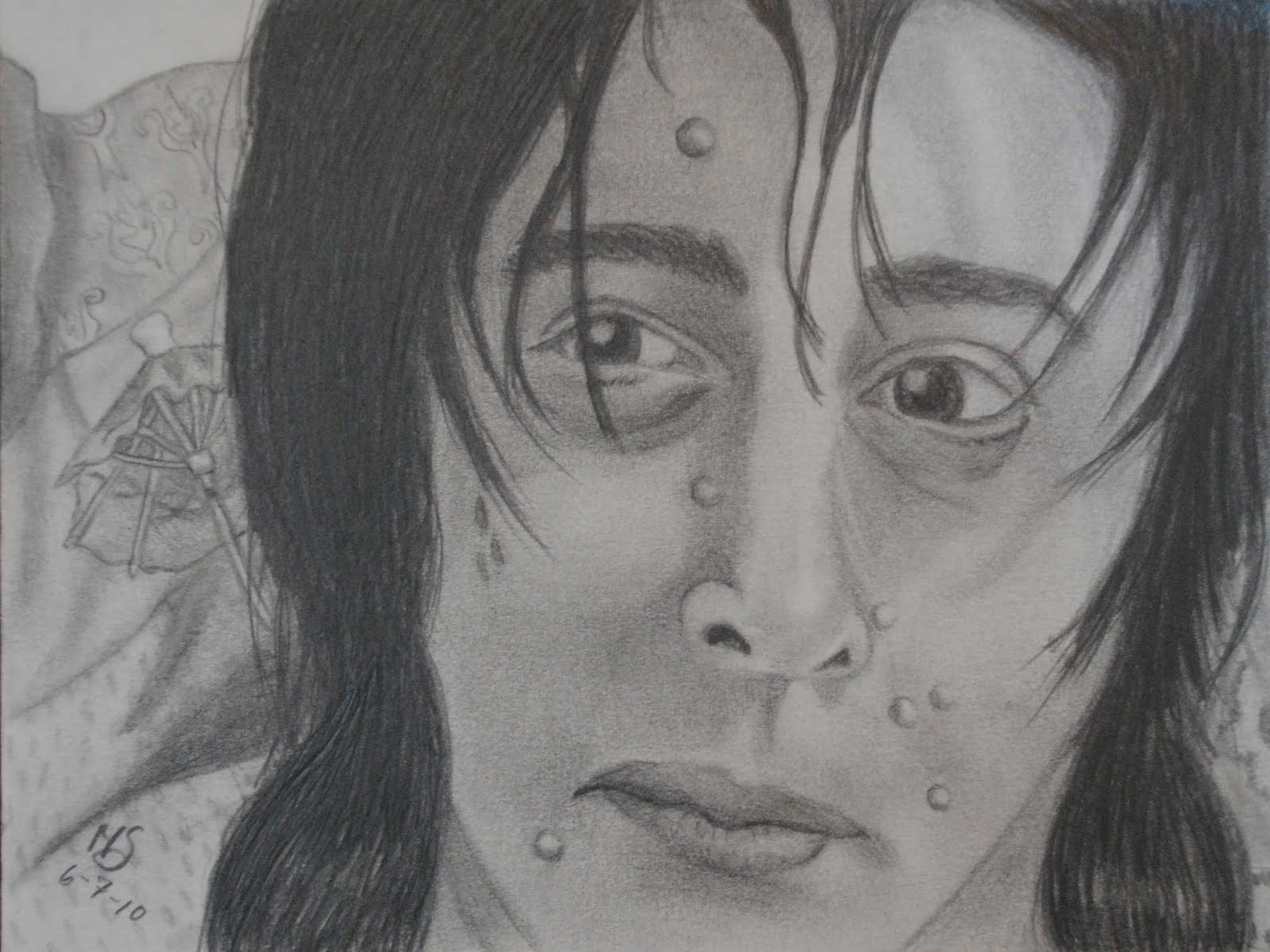 The Spleen from the movie "Mystery Men"
 Amy Peterson from the movie "Fright Night" . ( i don't know anything about this. someone on deviantart.com suggested I draw it)
 Wikus Van de Merwe from the movie "District 9"

 Alan Cumming as Glitch from the Syfy series "Tin Man"
 Crispin Glover as Willard from the movie "Willard"
 My new clothes! :D
 All my plants together... except for the new one I got today
So, I had wanted to draw Uncle Remus for a long time now, and finally a group on deviantart.com offered a prompt. It was to pick a live action movie ( since you don't see much fanart for live action movies), and make fanart for it. So I immediately signed up and claimed SotS. This was back at the beginning of the month. On the 1st of March, because we had a month to do it, and mine is due April 1st. So I have been working on it on and off since then. Mostly struggling to make Uncle Remus look darker ( first time I've ever drawn and African-American).
Then when I added in the colors I had my first experience coloring with markers ( outside of junk coloring for school, and coloring books as a kid). So... that was interesting. I used Stampin Up! markers, but I hear Copics work better... so maybe one day I can try those.
And then I encountered another problem. Bre'r Rabbit. At first I colored him with brown markers because he was brownish in the movies. But in order to get a more solid coat I had to add another layer of ink, and by this time he was DARK brown. The next day, I went to Disney and went on splash mountain. And wouldn't you know it, this darn rabbit is GRAY! So, the day after that, I painted over the brown marker with gray acrylic paint. And I think he looks much better now.
One day, when I have the software and know-how to do it, I'm going to make images that show the progression of each of my drawings so people can see how positively aweful my drawings look during the first few sessions I work on them :D
And now, without further to do..............

Image is a little blurry towards the top. Might take some better pictures at some point and switch out the image for a better one.

 (Click picture to make it bigger!)


Todays challenge on 365 cards was a sketch. Initially I was going to try and make a card that combined 3 other challenges, but then when I was looking at other peoples cards for this sketch, someone had a picture of a tropical resort on the side of their blog, and then I knew I had to make a tropical card. So, This took me over an hour, maybe two. I think I over-stickled, but I like it. Enjoy.

If I were to do this card again I would probably rip the Bermuda Bay down further so that more of the photo paper showed, and buy a different color of stickles for the purple flower. Other than that, I'm pretty happy with it.
ON BRACKETS:
Oh! I didn't have anything to make the brackets with, so I punched a scallop, then stuck the scallop into a circle punch. Of course, the two times I did it they didn't come out even so I had to trim them a little. ANYWAY, then I was looking through the new cards people entered for this challenge and found Catstamps. Thanks to her entry I learned how to make brackets without a bracket punch!! If you have time check out her blog. If not, I'll tell you real quick that you use a tab punch. So you are using the side of the center ( where you will see it dips and bumps like a bracket) and you just punch once onto paper, and then again lining it up about a centimeter from the first time and it should leave you with a bracket. Pretty cool, huh?
Melissa
This Card:


